Tracelink University
## Breadcrumb
1. [Home](/)
2. [Resources](/resources/resource-center)
3. [TraceLink University](/resources/tracelink-university)
# Define and Design New Pages
Overview, Layout, and Configuration Guide

- [Download PDF](/node/29271/pdf)
- [Share](#)
- [ LinkedIn ](https://www.linkedin.com/shareArticle?mini=true&url=https://www.tracelink.com/resources/tracelink-university/define-and-design-new-pages&title=Define and Design New Pages&summary=The New page allows users to create new instances of application objects and includes various essential elements for the process.&source=TraceLink "LinkedIn")
- [ Facebook ](https://www.facebook.com/share.php?u=https://www.tracelink.com/resources/tracelink-university/define-and-design-new-pages&t=Define and Design New Pages "Facebook")
- [ Mail ](mailto:?subject=Define and Design New Pages+|+TraceLink&body=https://www.tracelink.com/resources/tracelink-university/define-and-design-new-pages "Mail")
- [ Twitter ](https://twitter.com/intent/tweet?text=Define and Design New Pages https://www.tracelink.com/resources/tracelink-university/define-and-design-new-pages&via=TraceLink "Twitter")
#### Table of contents
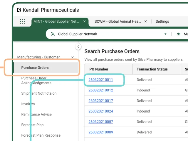
## Overview
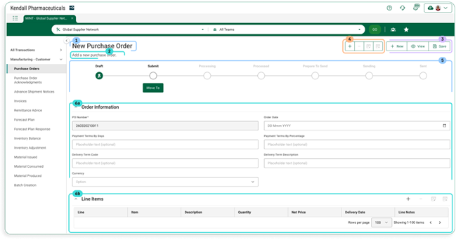
Users create new instances of application objects using the New page. The page contains the following elements:
1. Page title
2. Assistive text
3. Object operations toolbar
4. Collection operations toolbar
5. Workflow progress indicator bar
6. One or more form sections which contain either:
- Simple fields and groups
- A collections table
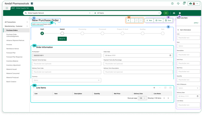
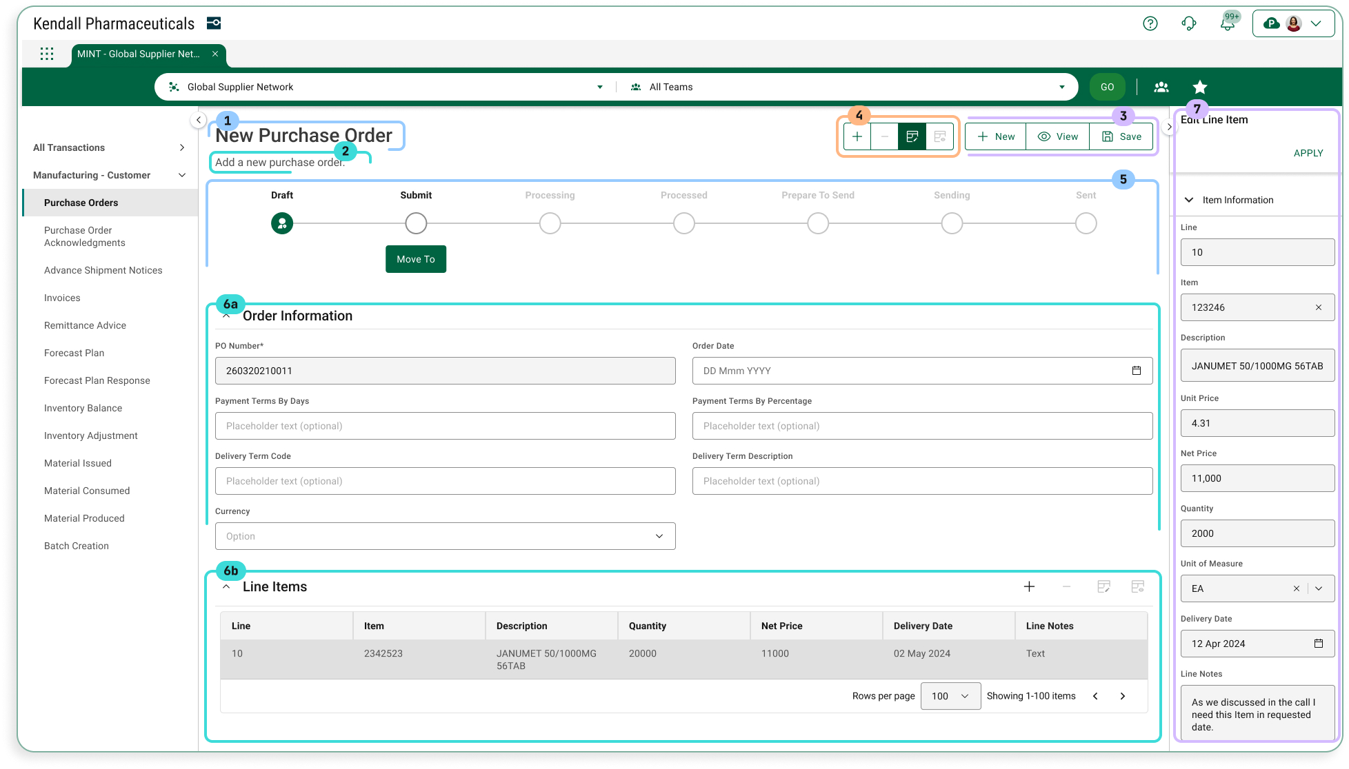
7. Push panel for collection operations New and Edit
## Layout
##### Sample Screen (User)
**Default View**
**With Add Collection Row Push Panel**
**With Edit Collection Row Push Panel**
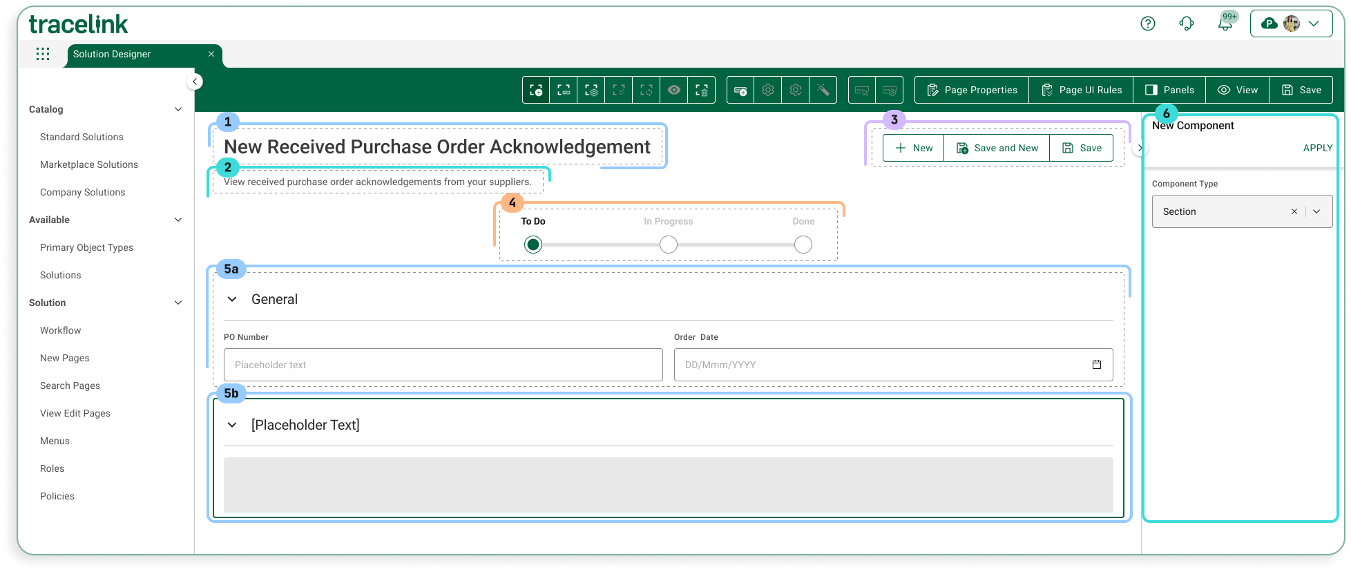
##### Sample Screen (Solution Designer)
**Default View**
## Configuration
##### Page Title
The page title shows the page’s title. The convention is that the value is “New” followed by the object that is being created (e.g. New Purchase Order).
**Contents**
Data TypeValueExampleStatic TextNew \[Object Type\]New Purchase
**Information for Solution Designers**
The page title is a required element that cannot be removed from the page.
*Design Conventions*
Page title is “New \[Object Type\]” (e.g. “New Purchase Order”).
*Configuration Options*
Not applicable. The page title element’s design cannot be modified.
##### Assistive Text
Assistive Text is a text value that is set by the Solution Designer.
**Contents**
**Data Type****Value****Example**Static Text\[Set by Solution Designer\]Enter information for the new purchase order. At a minimum, you must supply values for the required fields.
**Information for Solution Designers**
Assistive text should always be displayed on Search pages.
*Design Conventions*
**Property****Convention**Text lengthNo more than 100 characters.Writing styleAdheres to the OPUS Writing Guidelines
*Configuration Options*
**Property****Parameter****Option****Description**HiddenOn/OffOff (default)The page instructions are visible (i.e. not hidden). As a best practice, assistive text should always be visible in accordance with the design conventions.OnThe page instructions are hidden.
##### Object Operations Toolbar
The buttons in the object operations toolbar apply to the page or main object, as opposed to the buttons on the collections toolbar, which apply to collections inside the page.
**Contents**
ElementTypeDescriptionNew
Toolbar ButtonSelecting this button navigates to a blank version of the same page, which is the same as reverting the page back to its default state. Any values entered are not saved.Save and NewToolbar ButtonSelecting this button does the following:
- Validates the user’s entries (i.e. ensures that all required fields have values).
- If validation does not pass, the user sees a corresponding error snackbar.
- If validation succeeds, a new object instance is created with the current values of all fields, and a success message appears verifying the object is created.
- The page refreshes and all fields revert back to their default state, so the user can create another new instance of the object.
SaveToolbar ButtonSelecting this button does the following:
- Validates the user’s entries (i.e. ensures that all required fields have values).
- If validation does not pass, the user sees a corresponding error snackbar.
- If validation succeeds, the new object instance is created and the user is navigated back to the object Search page.
**Information for Solution Designers**
*Design Conventions*
The object operations toolbar can be hidden, but only if there are no operations that can be performed on the page. Otherwise the object operations toolbar design cannot be modified.
*Configuration Options*
Applies ToPropertyParameterValuesDescriptionToolbarHiddenOff/OnOff (default)The toolbar is visible (i.e. not hidden).OnThe toolbar is hidden.Toolbar ButtonHiddenOff/OnOff (default)The button is visible (i.e. not hidden).OnThe button is hidden.
##### Collection Operations Toolbar
The collection operations toolbar contains actions that apply to collections within the new object. Collections are a type of data element that can have multiple values within a particular object instance. For example, a collection of transaction IDs contains all transaction IDs that apply to a single Purchase Order. The collection operations toolbar appears at the top of the New page and above each collection table.
**Contents**
ElementTypeDescriptionNewToolbar ButtonSelecting this button opens the New collection row push panel.EditToolbar ButtonSelecting this button opens the Edit collection row push panel with data from the selected row in the active collection table. This button is only enabled if a row is selected.RemoveToolbar ButtonSelecting this button removes the selected row from the active collection table. This button is only enabled if a row is selected.
**Information for Solution Designers**
*Design Conventions*
Not applicable. The collection operations toolbar design cannot be modified.
*Configuration Options*
Applies ToPropertyParameterValuesDescriptionToolbarHiddenOff/OnOff (default)The toolbar is visible (i.e. not hidden)OnThe toolbar is hidden.Toolbar ButtonHiddenOff/OnOff (default)The button is visible (i.e. not hidden).OnThe button is hidden.
##### Progress Indicator
The progress indicator is an optional component that illustrates the state of the object instance. This is particularly useful for objects that go through a workflow. For example, a Purchase Order object may go from “To Do” (i.e. not started) to “In Progress” to “Done.”
**Contents**
ElementSub ElementTypeDescriptionActive StateState NameTextThe name of the state (e.g. ”To Do,” “In Progress”). Configurable by the Solution Designer.State IconIconIndicates the state is active.Non-active StateState NameTextThe name of the state (e.g. ”To Do,” “In Progress”). Configurable by the Solution Designer.State IconIconIndicates the state is not active.
**Information for Solution Designers**
*Design Conventions*
PropertyConventionFirst state name (i.e. the initial state of the object)Use “To Do”Last state name (i.e. the state of the object when the workflow is completed)Use “Done”
*Configuration Options*
Applies ToPropertyValuesDescriptionProgress IndicatorHiddenOff (default)The indicator is visible (i.e. not hidden)OnThe indicator is hidden.Progress IndicatorNumber of statesNumberThe number of states in the workflow.StateState NameTextThe name of the workflow state to display.
##### Form Section
A form section contains a form header and either:
- A combination of simple fields (e.g. Name, ID) and groups (a predefined set of logically connected fields)
- A collections table (described in the Collections Table section)
**Contents**
ElementTypeDescriptionSection NameTextThe name of the section.Section InputsSimple fields and groups
or
Collections tableA section can contain a combination of simple fields and groups or a single collections table. A collections table cannot be mixed with other inputs.
**Information for Solution Designers**
*Design Conventions*
PropertyConventionsSection Layout ColumnsFields inside TraceLink form groups can either appear in a one-column layout (with long fields) or a two-column layout (with shorter fields).Section NameUse descriptive nouns for group names (e.g. “Shipping Address”). Do not include verbs in the section name. If the page has only one section, hide the section name because it will be redundant with the page title.Section Fields and GroupsEach section should contain logically connected fields and groups. The best practice is to have between 3 and 8 fields per section.
- If a section has fewer than 3 fields, consider merging it into another section, if they can be logically combined.
- If a section has more than 8 fields, consider splitting it into separate sections, if they can be logically separated.
*Configuration Options*
Applies ToPropertyParameterValuesDescriptionSection HeaderHiddenOff/OnOff (default)The header is visible (i.e. not hidden).OnThe header is hidden.Section HeaderCollapseOff/OnOn (default)The section can be collapsed and expanded. The corresponding icons are present.OffThe section cannot be collapsed and expanded. The corresponding icons are not present.
##### Collection Table
A collection is a particular data element that can have multiple values within a particular object instance. For example, a Purchase Order object instance might have multiple transaction IDs, thus transaction IDs are a collection inside the Purchase Order object. Each collection inside an object is displayed in its own collections table.
**Contents**
ElementTypeDescriptionTable FieldsField ListThe ordered set of fields contained in the table.Table FieldText, Select List, or Date/TimeAn individual field for entering data to an item in the collection.
**Information for Solution Designers**
*Design Conventions*
PropertyConventionField OrderKey fields that help identify a particular row (e.g. Name, ID) should appear first (leftmost). Fields that are less likely to be used to identify a row (e.g. Date, Description) should appear after the key fields.
*Configuration Options*
Not applicable. The collection table design cannot be modified.
##### New Collection Row Push Panel
The New Collection Row push panel (accessed by selecting the New icon on the Collection Toolbar when a collections table is active) provides a means for users to add a new data row to a collection.
**Contents**
AreaElementDescriptionHeaderPush Panel Title“New” static text.Apply ButtonValidates the user’s entries (e.g. ensures values supplied for all required fields) and then:
- If validation fails, TraceLink shows the corresponding error message.
- If validation passes, TraceLink adds the row to the collection table.
Close ButtonSelecting this button closes the push panel.Push Panel ContentField ListAll fields that are displayed in the push panel. The fields that appear here can be set in the OPUS Solution Environment (OSE).Field (inside Field List)The label and corresponding data entry field.
**Information for Solution Designers**
*Design Conventions*
PropertyConventionField ListThe push panel should contain the same fields that are in the collection table.Field List OrderThe order of the fields in the push panel should match the order of the fields in the corresponding collection table.
*Configuration Options*
The user sets the push panel field contents per the above conventions.
##### Edit Collection Row Push Panel
The Edit Collection Row Details push panel (accessed by selecting the Edit icon on the Collection Toolbar when a row in an active collections table is selected) provides a means for users to edit a row in a collection.
**Contents**
AreaElementDescriptionHeaderPush Panel Title“Edit” static text.Apply ButtonValidates the user’s entries (e.g. ensures values supplied for all required fields) and then:
- If validation fails, TraceLink shows the corresponding error message.
- If validation passes, TraceLink updates the row in the collections table with the values that were entered in the push panel.
Close ButtonSelecting this button closes the push panel.Push Panel ContentField ListAll fields that are displayed in the push panel. The fields that appear here can be set in the OPUS Solution Environment (OSE).Field (inside Field List)The label and corresponding data entry field.
**Information for Solution Designers**
*Design Conventions*
PropertyConventionField ListThe push panel should contain the same fields that are in the collection table.Field List OrderThe order of the fields in the push panel should match the order of the fields in the corresponding collection table.
*Configuration Options*
The user sets the push panel field contents per the above conventions.
[TraceLink University](/tags/tracelink-university)
#### Table of contents
##### Related Content
[  ](/resources/tracelink-university/get-started-designing-opus-platform-opus-anthem)
##### Get Started Designing on the OPUS Platform With OPUS Anthem
Anthem is TraceLink's Design System that establishes consistent design conventions across the OPUS Platform, allowing designers to quickly create solutions that meet various business and user needs.
[View More](/resources/tracelink-university/get-started-designing-opus-platform-opus-anthem)
[  ](/resources/tracelink-university/understanding-page-types-within-opus-solution-environment-ose)
##### Understanding Page Types within the OPUS Solution Environment (OSE)
Page types enable Solution Designers to efficiently create user-friendly pages using a drag-and-drop interface, allowing them to organize information for optimal usability.
[View More](/resources/tracelink-university/understanding-page-types-within-opus-solution-environment-ose)
[  ](/resources/tracelink-university/define-and-design-workflows)
##### Define and Design Workflows
This guidance outlines essential practices for designing effective workflows that enhance efficiency and flexibility in business processes, focusing on primary objects to help OPUS Solution Designers create impactful solutions.
[View More](/resources/tracelink-university/define-and-design-workflows)
[  ](/resources/tracelink-university/design-considerations-roles-and-policies)
##### Design Considerations With Roles and Policies
User access in a solution is managed through permissions, roles, and policies: permissions define specific actions, roles group these permissions for streamlined access, and policies enforce the logic that determines what users can do, ensuring data protection and security compliance.
[View More](/resources/tracelink-university/design-considerations-roles-and-policies)
[  ](/resources/tracelink-university/define-and-design-search-pages)
##### Define and Design Search Pages
Search pages enable users to view, search for, and create new object instances, typically serving as the landing page when navigating to a solution, except when only one instance exists (like the Profile page in Settings), in which case the user is directed to the View/Edit page.
[View More](/resources/tracelink-university/define-and-design-search-pages)
[  ](/resources/tracelink-university/define-and-design-viewedit-pages)
##### Define and Design View/Edit Pages
Overview, layout, and configuration guide for defining and designing view/edit pages/
[View More](/resources/tracelink-university/define-and-design-viewedit-pages)