
Table of contents
Overview
Search pages provide a means for viewing, searching for, and creating new object instances. Users typically land on a search page when first navigating to a solution. The only exception to this pattern is when there will only ever be one instance of an object (e.g. the Profile page in Settings). In that scenario, navigating to a solution displays the View/Edit page for the object instance.
A Search page contains a table where each row represents an object instance, a Filter push panel that narrows the contents of the table based on specific criteria (e.g. only the purchase orders created within a given date range), and a toolbar with the following page level functions:
- New – Navigates a user to a New page for the object, where a user can add a new instance of the object.
- Filter – Opens the Filter push panel.
Additionally, when a user selects a particular object instance in the table, they can perform the following operations to that object instance:
- View Details – Opens the View Details push panel where more information about the object instance is displayed.
- Copy – Opens a New page with the same values as the selected instance.
- Remove – Removes the object instance.
Layout
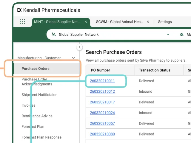
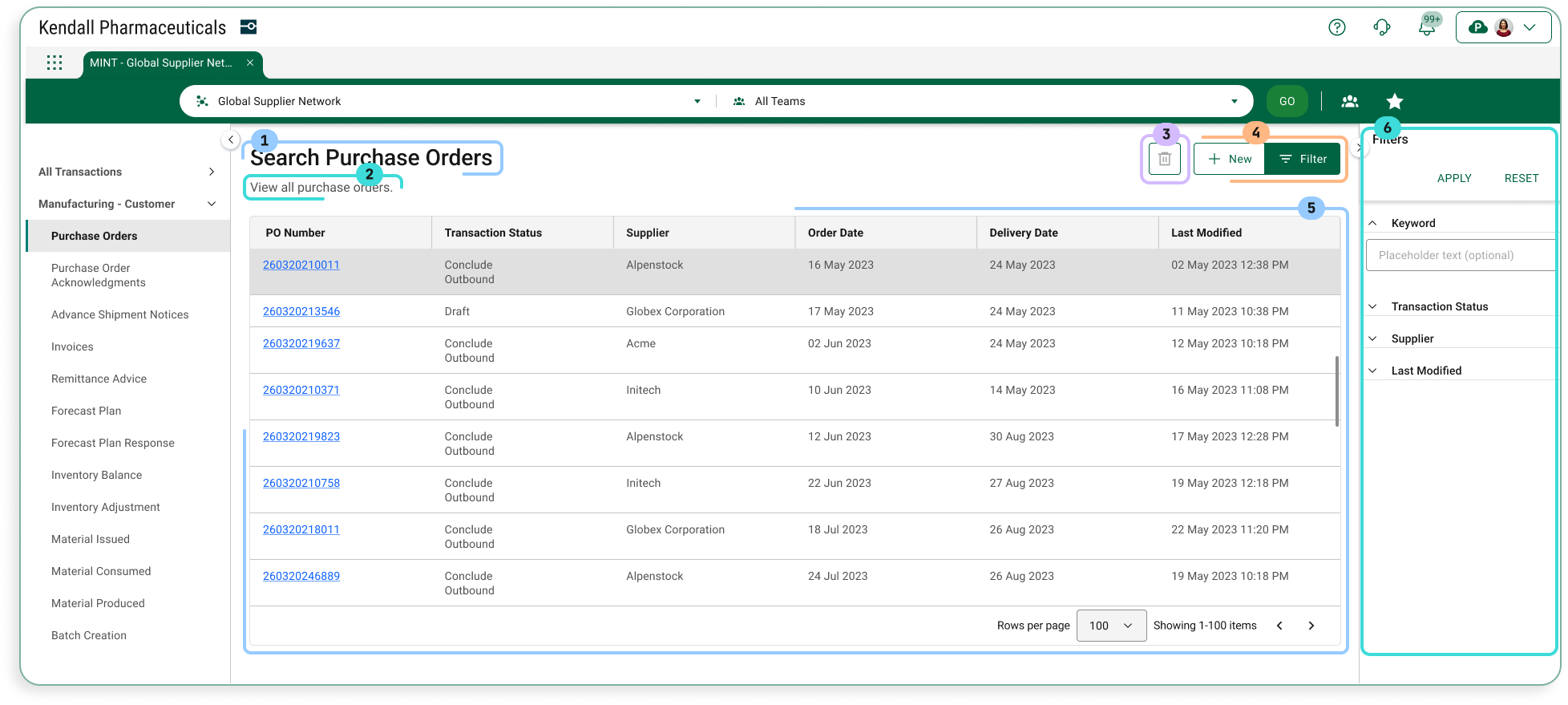
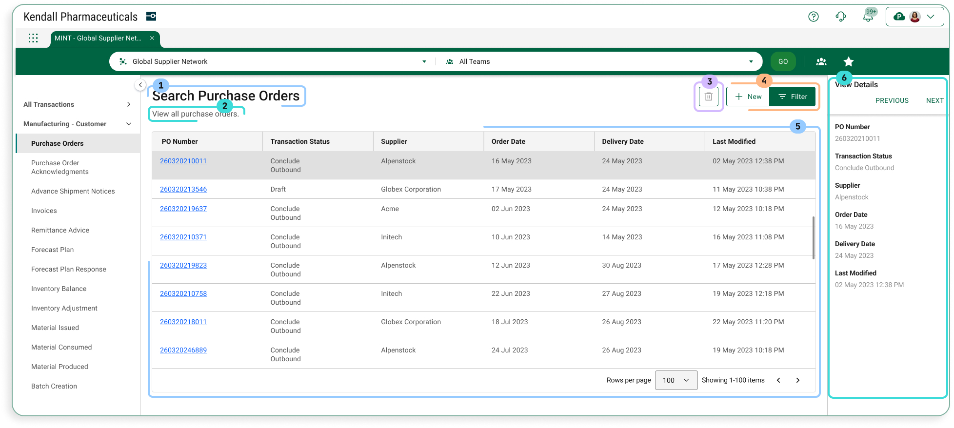
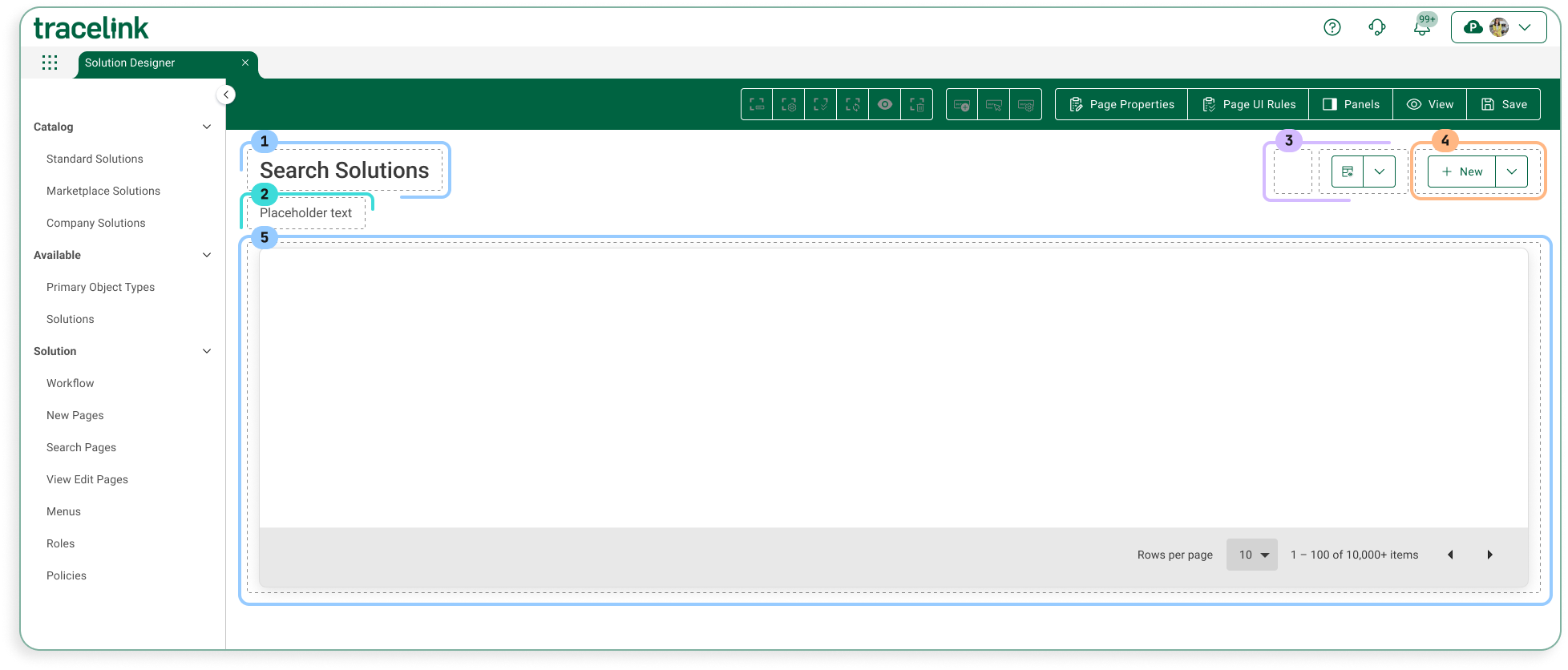
The following images show how the following components are laid out in a Search page. The components inside the page are the following:
- Page title
- Assistive text
- Object operations toolbar
- Page operations toolbar
- Object table
- Push panel for Filters or View Details
Sample Screen (User)
With Filter Panel
With View Details Panel
Sample Screen (Solution Designer)
Configuration
Page Title
The page title shows a page’s title. The convention is that the value is “Search” followed by the plural form of the object type that is being searched for on the page (e.g. Search Purchase Orders).
Contents
| Data Type | Value | Example |
|---|---|---|
| Static Text | Search [Object Type]s | Search Purchase Orders |
Information for Solution Designers
The page title is a required element that cannot be removed from the page.
Design Conventions
Page title is “Search [Object Type]s” (e.g. “Search Purchase Orders”).
Configuration Options
Not applicable. The page title element’s design cannot be modified.
Assistive Text
Assistive Text is a text value that is set by the Solution Designer.
Contents
| Data Type | Value | Example |
|---|---|---|
| Static Text | [Set by Solution Designer] | The table below shows purchase orders in progress. To create a new purchase order, select the New button. |
Information for Solution Designers
Assistive text should always be displayed on Search pages.
Design Conventions
| Property | Convention |
|---|---|
| Text length | No more than 100 characters. |
| Writing style | Adheres to the OPUS Writing Guidelines |
Configuration Options
| Property | Parameter | Option | Description |
|---|---|---|---|
| Hidden | On/Off | Off (default) | The page instructions are visible (i.e. not hidden). As a best practice, assistive text should always be visible in accordance with the design conventions. |
| On | The page instructions are hidden. |
Object Operations Toolbar
The object operations toolbar contains actions that apply to an object instance. The buttons in this toolbar are only enabled if a specific object instance is selected in the object table.
Contents
| Element | Type | Description |
|---|---|---|
| View Details | Toolbar Button | Opens the View/Edit push panel, where more detailed information about the selected object instance is displayed. |
| Clone | Toolbar Button | Creates a new object instance with the same values as the selected object instance. |
| Remove | Toolbar Button | Removes the selected object instance and all its data. Users will need to confirm this action in a confirmation dialog. |
Information for Solution Designers
Design Conventions
The object operations toolbar can be hidden, but only if there are no operations that can be performed on the page. Otherwise the object operations toolbar design cannot be modified.
Configuration Options
| Applies To | Property | Parameter | Values | Description |
|---|---|---|---|---|
| Toolbar | Hidden | Off/On | Off (default) | The toolbar is visible (i.e. not hidden). |
| On | The toolbar is hidden. | |||
| Toolbar Button | Hidden | Off/On | Off (default) | The button is visible (i.e. not hidden). |
| On | The button is hidden. |
Page Operations Toolbar
The page operations toolbar contains functions that apply regardless of the selected object instance or the state of the object table.
Contents
| Element | Type | Description |
|---|---|---|
| New | Toolbar Button | Navigates the user to the New page for the object. |
| Filter | Toolbar Button | Opens the Filters push panel, where users can enter criteria to refine the set of objects that are displayed in the table. |
Information for Solution Designers
Design Conventions
The page operations toolbar can be hidden, but only if there are no operations that can be performed on the page. Otherwise the page operations toolbar cannot be modified.
Configuration Options
| Applies To | Property | Parameter | Values | Description |
|---|---|---|---|---|
| Toolbar | Hidden | Off/On | Off (default) | The toolbar is visible (i.e. not hidden) |
| On | The toolbar is hidden. | |||
| Toolbar Button | Hidden | Off/On | Off (default) | The button is visible (i.e. not hidden). |
| On | The button is hidden. |
Object Table
The object table occupies the majority of the content area of the page. It displays existing object instances and provides access to the View/Edit page for each object instance. Each column in the table represents a particular object field. Each row in the table represents an object instance. Instances that match the current filter criteria are displayed in the table. The filter criteria can be changed in the Filters push panel.
Contents
| Area | Element | Description |
|---|---|---|
| Header Row | Column header | Displays the name of the object field being displayed (e.g. “Purchase Order Number,” “Date Created,” etc.) |
| Current sort icon | Displays next to the field that the table’s data is currently sorted by. The direction of the icon shows if the data is sorted in ascending or descending order. | |
| Row Data | Link | Typically appears in the first field in a row as the ID number for the object instance. Selecting the link leads to the object instance’s View/Edit page. |
| Regular text | All other fields in an object instance are displayed as static text. |
Information for Solution Designers
Solution Designers set which data columns are displayed in the table and which data columns end users can sort and filter (in the Filters push panel component).
Design Conventions
| Property | Convention |
|---|---|
| First Column Field | The first column in every table on a Search page represents the object instance. Typically this will be the ID number for the object (e.g. Purchase Order Number). |
| First Column Data Type | The first column is a link. Selecting the link leads to the View/Edit page for the object. |
| Number of Columns | The table contains between 2 and 8 columns |
Configuration Options
| Applies To | Property | Parameter | Values | Description |
|---|---|---|---|---|
| Table | Hidden | Off/On | Off (default) | The table is visible (i.e. not hidden). |
| On | The table is hidden. | |||
| Default Sort Column | Column Number | [Column Number] (default is Column 1) | The default field to sort the table object instances by. | |
| Default Order | Ascending (default) | A to Z | ||
| Descending | Z to A | |||
| Rows | Number of Rows | Default Number of Rows |
| The Solution Designer can set the number of rows that the end user sees by default. |
| Column | Sortable | Yes/No | Yes (default) | The user can sort the table by the column. |
| No | The user cannot sort the table by the column. |
Filters Push Panel
The Filters push panel (accessed by selecting the Filter button) provides a mechanism for users to refine the set of objects that are displayed in the object table. Users can set data criteria in the push panel so that only object instances that adhere to those criteria are displayed in the object table (e.g. users can set filter criteria so that only object instances created on a certain date are displayed in the table).
Contents
| Area | Element | Description |
|---|---|---|
| Header | Push Panel Title | “Filters” static text. |
| Submit Button | Refreshes the data in the object table so that it matches the current filter criteria. | |
| Reset Button | Changes the filter criteria back to the default filter criteria. | |
| Close Button | Closes the Filters panel. | |
| Filter Elements List | Filter Elements List | All fields that can be used to filter the data. |
| Filter Element | Label | The name of the field, as static text. |
| Expand/Collapse Icon | Shows or hides the element’s Filter Input Field(s). | |
| Filter Input Field(s) | Fields where criteria is entered to determine which object instances are displayed in the object table. The type of input(s) displayed depends on the type of criteria field being used. Field Type: Text Field Type: Date Field Type: Date Range Field Type: True/False Field Type: Yes/No |
Information for Solution Designers
Design Conventions
Not applicable. The page filters push panel design cannot be modified.
Configuration Options
| Applies To | Property | Parameter | Values | Description |
|---|---|---|---|---|
| Push Panel | Hidden | Off/On | Off (default) | The push panel is not visible (i.e. not hidden). |
| On | The push panel is hidden. The filter icon button on the toolbar is also hidden. |
View Details Push Panel
The View Details push panel (accessed by selecting the View Details object icon when an object row is selected in the page table) provides a mechanism for users to view detailed information about an object instance without navigating to the View/Edit page.
Contents
| Area | Element | Description |
|---|---|---|
| Header | Push Panel Title | “View Details” static text. |
| Previous Button | Shows the details for the previous object instance in the table. | |
| Next Button | Shows the details for the next object instance in the table. | |
| Close Button | Closes the push panel. | |
| Panel Content | Field List | All fields that are displayed in the push panel. The fields that appear here can be set in the OPUS Solution Environment (OSE). |
| Field N | The label and object instance’s value for that field. |
Information for Solution Designers
Design Conventions
| Property | Convention |
|---|---|
| Field List | The View Details push panel should at least contain the same fields that are in the object table on the Search page. |
| Field List Order | The order of the fields in the push panel should match the order of the fields in the table. In general, the order of the fields should match the order of the fields on the New and View/Edit pages. |
Configuration Options
| Applies To | Property | Parameter | Values | Description |
|---|---|---|---|---|
| Push Panel | Hidden | Off/On | Off (default) | The push panel is visible (i.e. not hidden). |
| On | The push panel is hidden. The view details icon button on the toolbar is also hidden. |